Often financial analysts are presented with statistical charts that purport to demonstrate an important — and, of course, investable — relationship between data points. These charts are supposed to be worth a thousand words and thousands of shares traded. But invariably these charts do not have an r-squared for the data displayed, or any other descriptive statistical data; just the seductive image. What is needed to help the (often) beleaguered analyst is an r-squared taxonomy, or catalog.
Take-aways:
- A better sense of what different r-squareds actually look like.
- How radically different looking charts generate similar r-squareds.
- Why it is crucial to use multiple tools, including charts, when analyzing data.
A Better Sense of What Different R-Squareds Actually Look Like
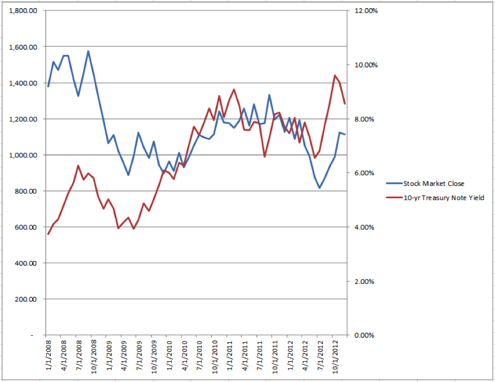
As an introduction take a look at the following chart:
While the graph shows a hypothetical performance for a hypothetical stock index and for a hypothetical sovereign 10-year Treasury note, I think you will agree with me that it is typical of a finance industry chart.
Take a look at how the data are only roughly related to one another between January 2008 to April 2010, and then they appear to track each other very closely. I could continue using flowery language and a successful analyst pedigree to try and convince you to trade with my firm. Sound familiar?
Would it surprise you to learn that the r-squared for the above chart is a lowly 2.18%?! To better educate you as to what different r-squareds look like here is an r-squared taxonomy compiled using a random chart generator, based in real-world data, and after thousands of trials. [Keep at it, too, there is more analysis at the bottom of the post.]
R-Squared = 0.00%
How can it be that this chart has an r-squared of 0.00% when between July 2009 and January 2011 it looks as if there is so much similarity? Remember that r-squared is a summary measure and that it is calculated as 1 − (sum of squared errors ÷ sum of squares total). Consequently, data can cancel one another out and affect the calculation positively or negatively.
R-Squared = 10.00%
R-Squared = 20.01%
R-Squared = 29.97%
R-Squared = 40.01%
R-Squared = 49.99%
R-Squared = 60.00%
R-Squared = 70.04%
R-Squared = 80.03%
R-Squared = 90.00%
How Radically Different Looking Charts Generate Similar R-Squareds
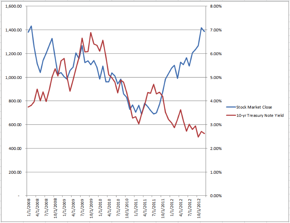
Most of the time when financial analysts think of r-squared they think of similarity, rather than relatedness or causality. The preceding charts show that the higher the r-squared the more closely the lines tend to track one another. But this is very dangerous thinking! In the thousands of trials done in order to create this post the highest r-squared chart randomly generated was a whopping 93.37%. But take a look at its chart below.
R-Squared = 93.37%
I bet you are surprised by the above result because, as I said, analysts tend to think of r-squared as similarity. However, the above chart demonstrates very high negative correlation of −95.29%. If you look at the chart above you will see a vintage of chart that recurred throughout the r-squared random trials: a scissors pattern. Count me among the educated by this experiment as I have never looked for scissors patterns when sifting through charts for causal relationships.
Take a look at various manifestations of scissors brethren.
R-Squared = 50.07%
Interestingly, look at the difference between the 50.07% and the 49.99% chart from before. While separated by only 0.08%, the two charts could hardly look more different.
R-Squared = 69.99%
Again, compare the 69.99% and the 70.04% r-squared charts, separated by just 0.05%. Last, compare the 90.81% r-squared graph below with the 90.00% chart above. What a dramatic difference.
R-Squared = 90.81%
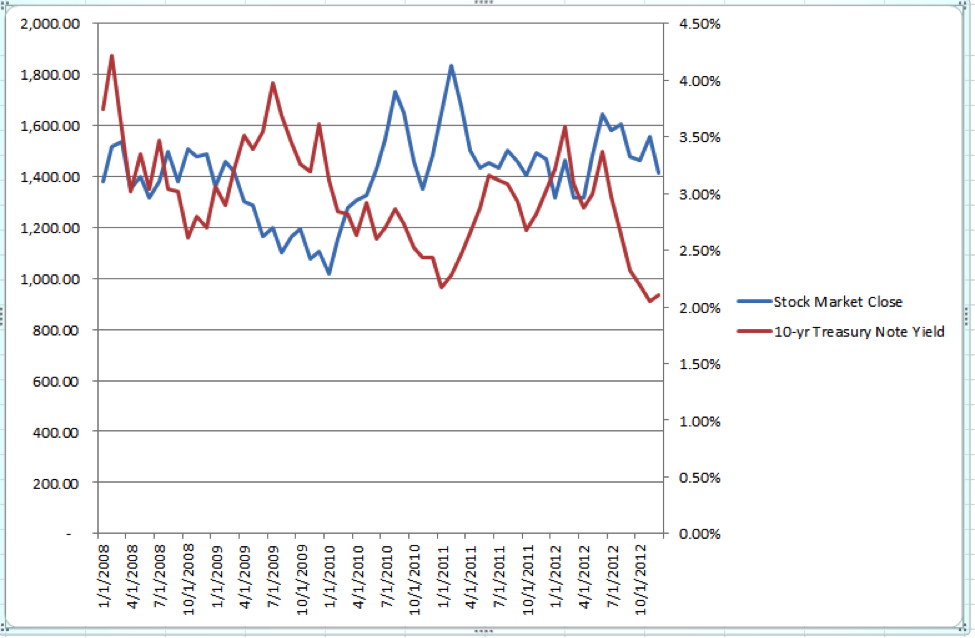
Like everything in finance, reading charts is more complicated than just memorizing several heuristics, like “be on the look out for the scissors pattern.” For example, look at these very different looking, but similar r-squareds that do not adhere to the scissors pattern.
R-Squared = 50.30%
To me, the above chart “looks like” it would have a lower r-squared than the preceding 49.99% r-squared chart; yet, it is higher! Or what about the 92.31% r-squared below which looks to have a lower r-squared than the 90.0% chart:
R-Squared = 92.31%
For another interesting comparison look at the original 2.18% chart and compare it to the 10.0% r-squared chart. To further demonstrate how exactly the same r-squareds can look radically different compare these three very different ways of generating a theoretical 100.00% r-squared.
R-Squared = 100.00%, Identically Similar Movement
Here both data series move identically with one another; so much so, in fact, that you cannot distinguish the movement of the hypothetical stock market from the movement of the 10-Year Treasury Note Yield. [Note: For the skeptics, the presence of the left-hand scale indicates that the stock market close time series is present, just “underneath” the 10-year Treasury Note Yield series]
R-Squared = 100.00%, Scissors Movement (i.e., Negative Correlation)
R-Squared = 100.00%, Negative Correlation
Why It Is Crucial to Use Multiple Tools, Including Charts, When Analyzing Data
Hopefully I have demonstrated to you the futility of trusting your eyes when looking at chart data — seeing is not believing! It behooves analysts to study the r-squared taxonomy to ensure developing a feeling for what actual relationships of particular degrees look like. Chartists should broaden their scope to include data that demonstrate a scissors pattern/negative correlation and not just charts that track one another like dancers on a dance floor. Going forward it is obvious that understanding data well requires a combination of visuals and statistical measures.
Originally published on CFA Institute’s Enterprising Investor.




0 Comments